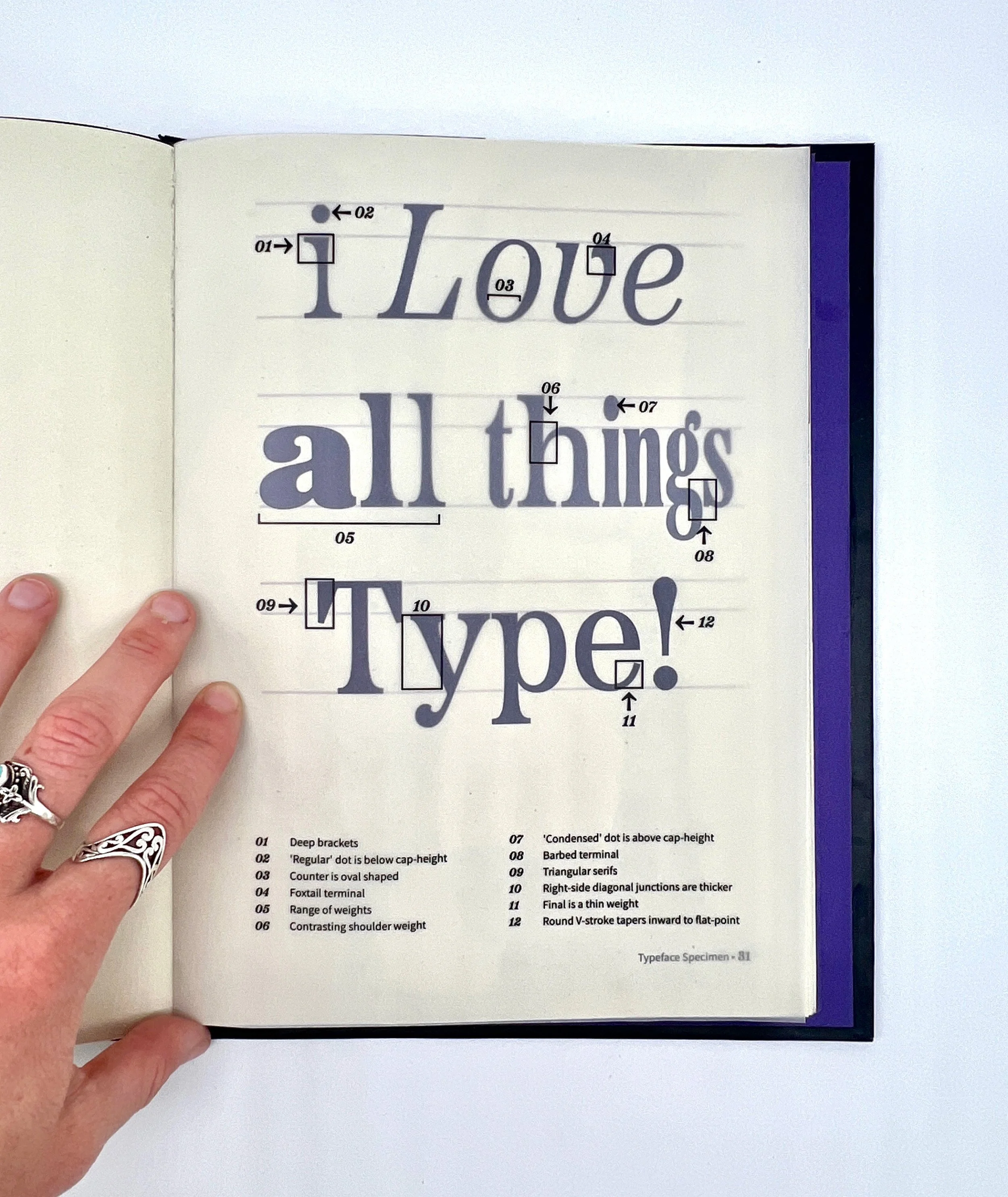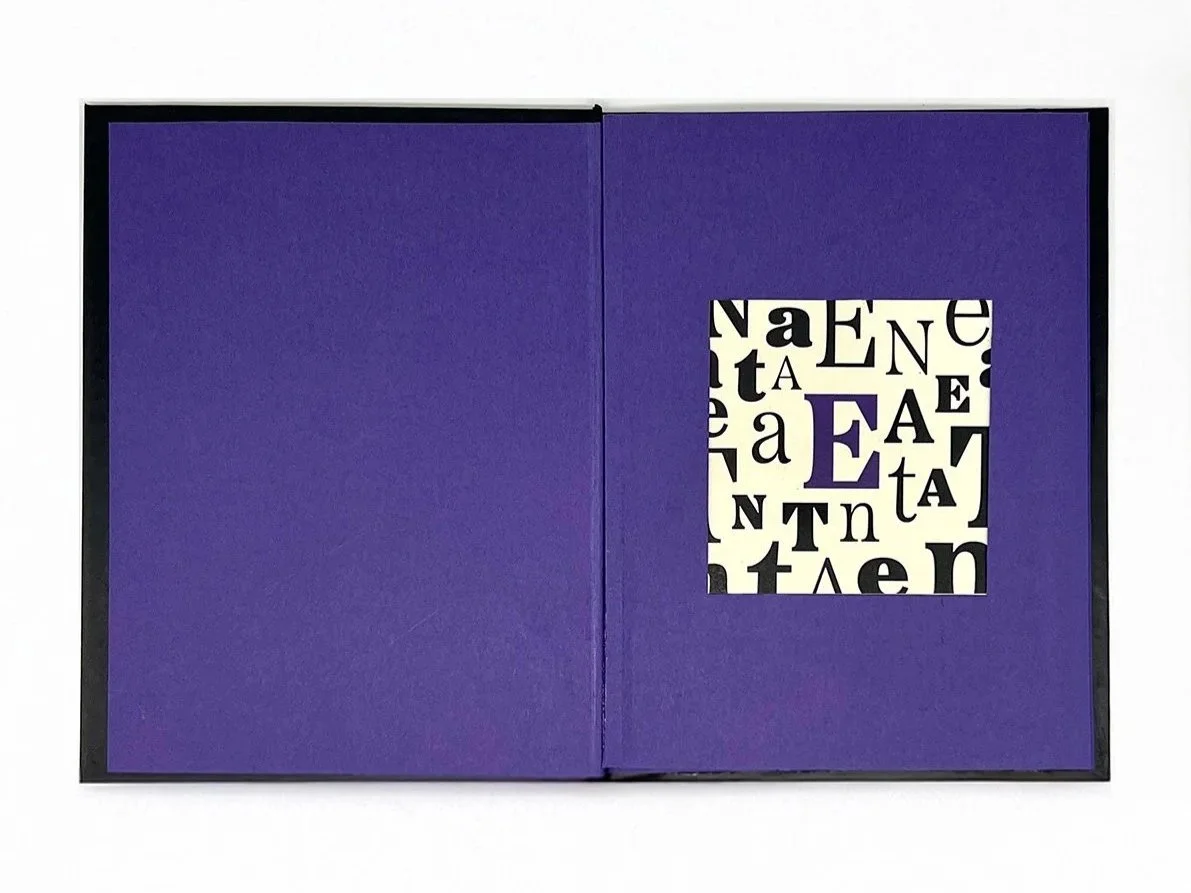
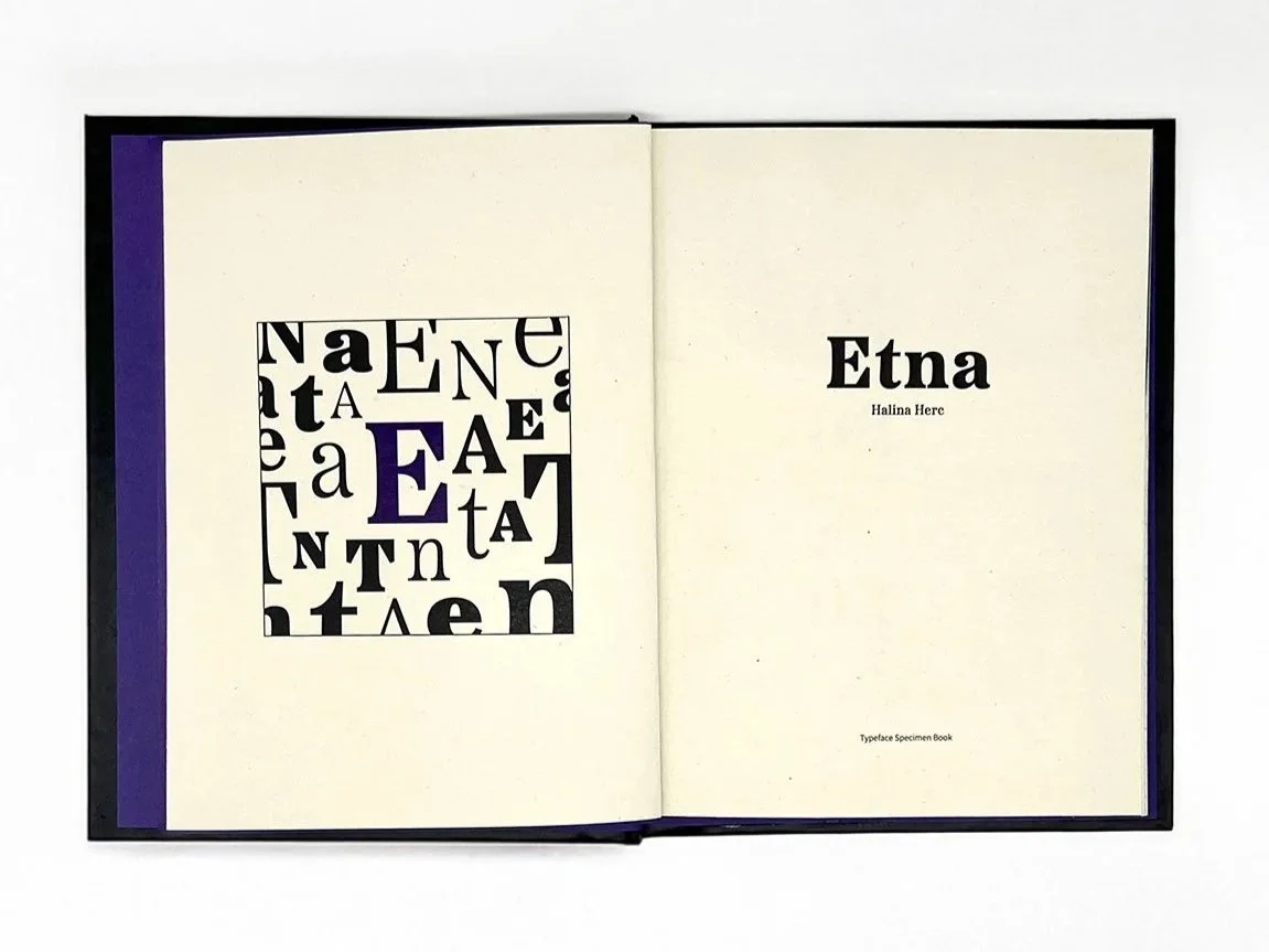
Etna Typeface Specimen Book—Indesign
Focus: To create an interactive book through typography, research, and book design.
Skills Applied: Typeface analysis, design craftsmanship, editorial layout
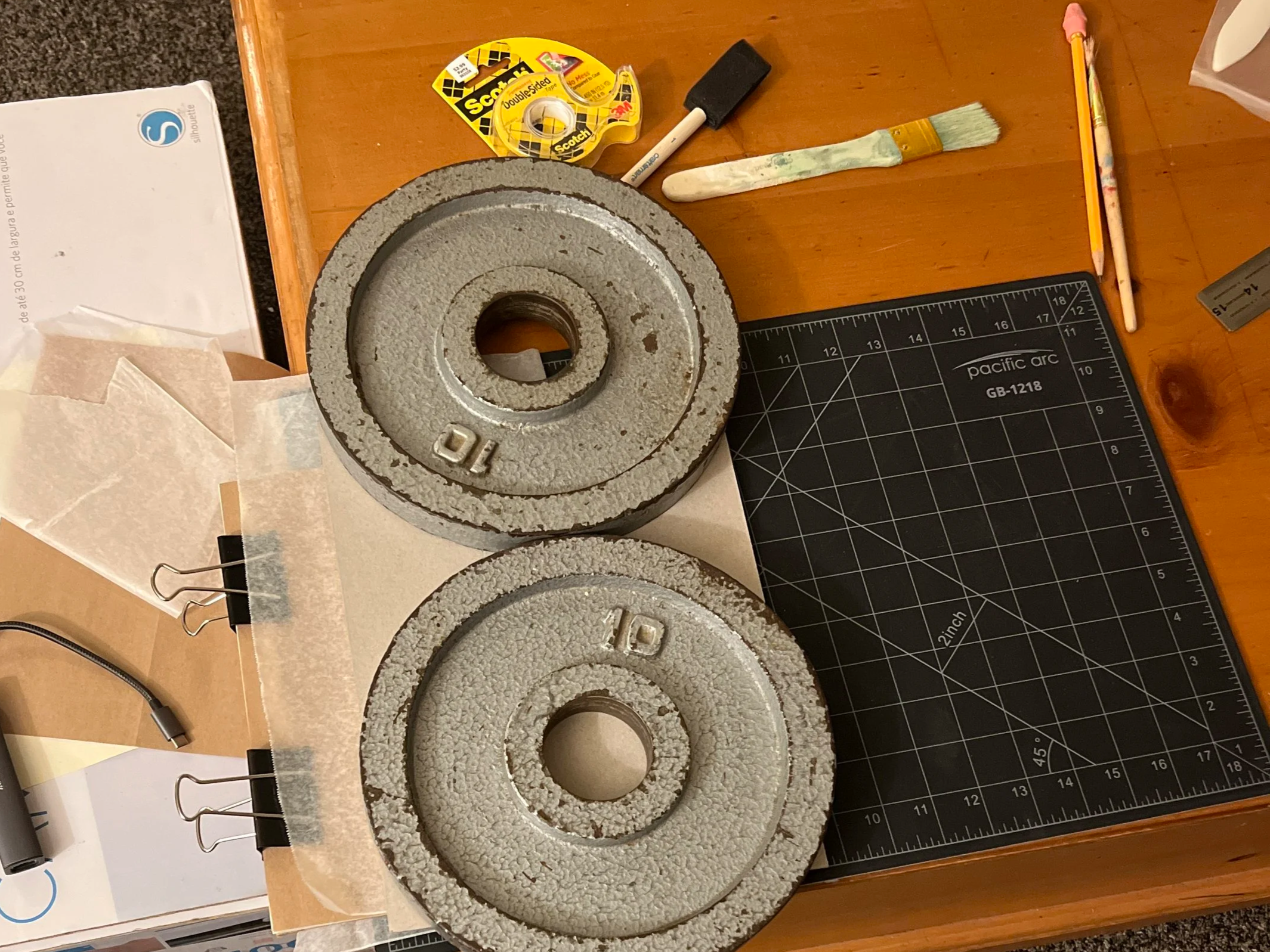
My Process

Reserch & Sketching
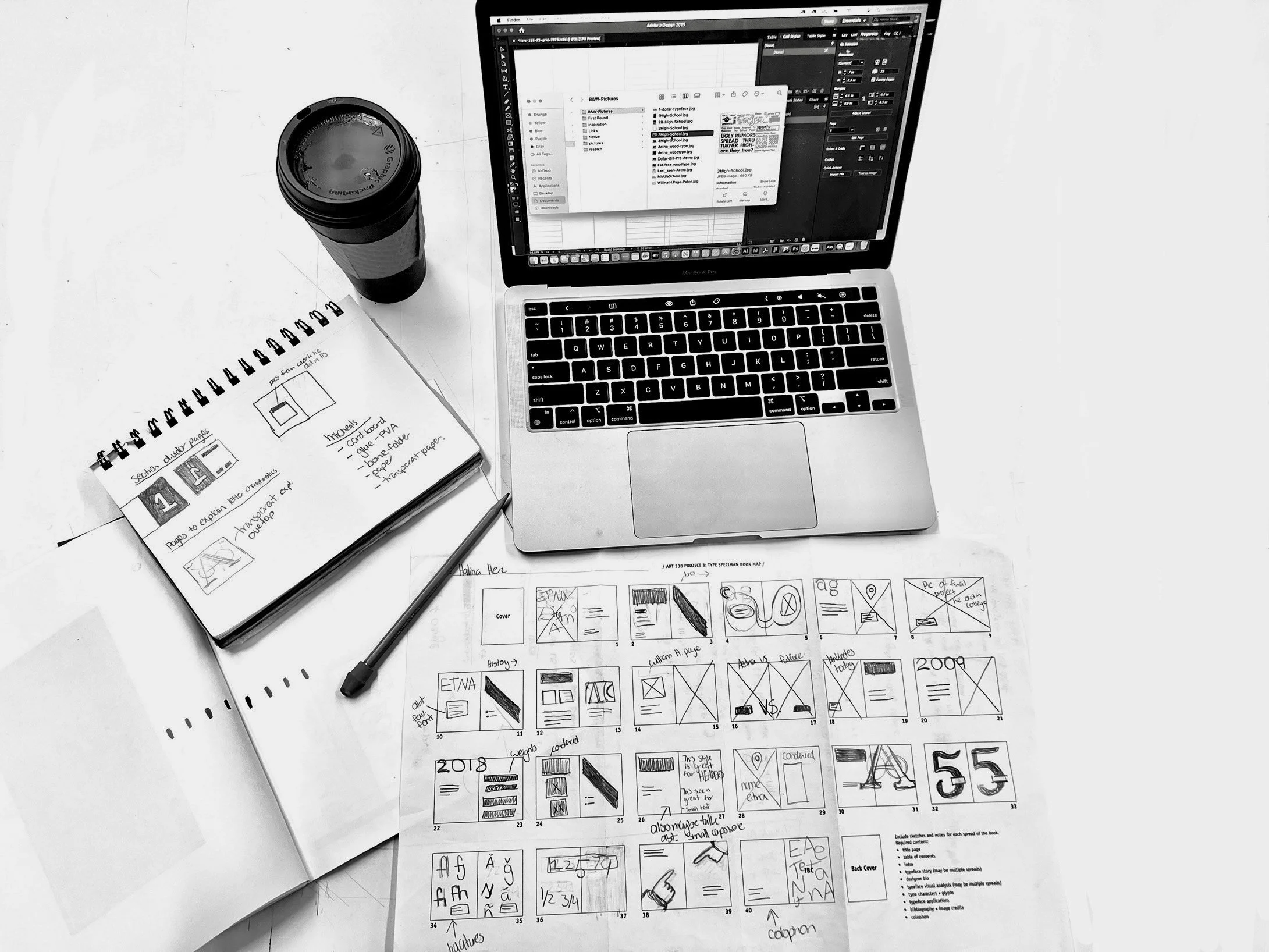

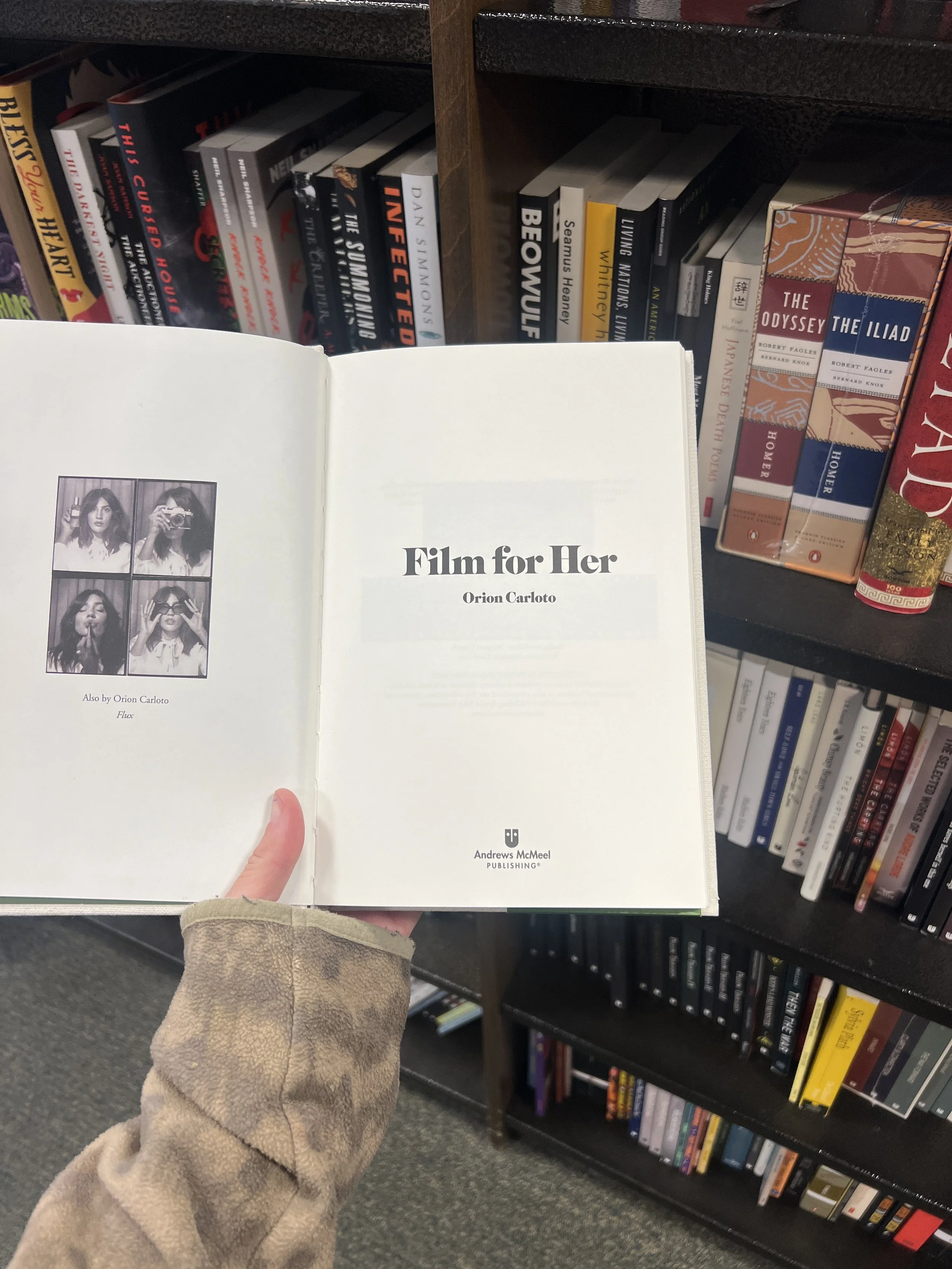
Finding inspiration
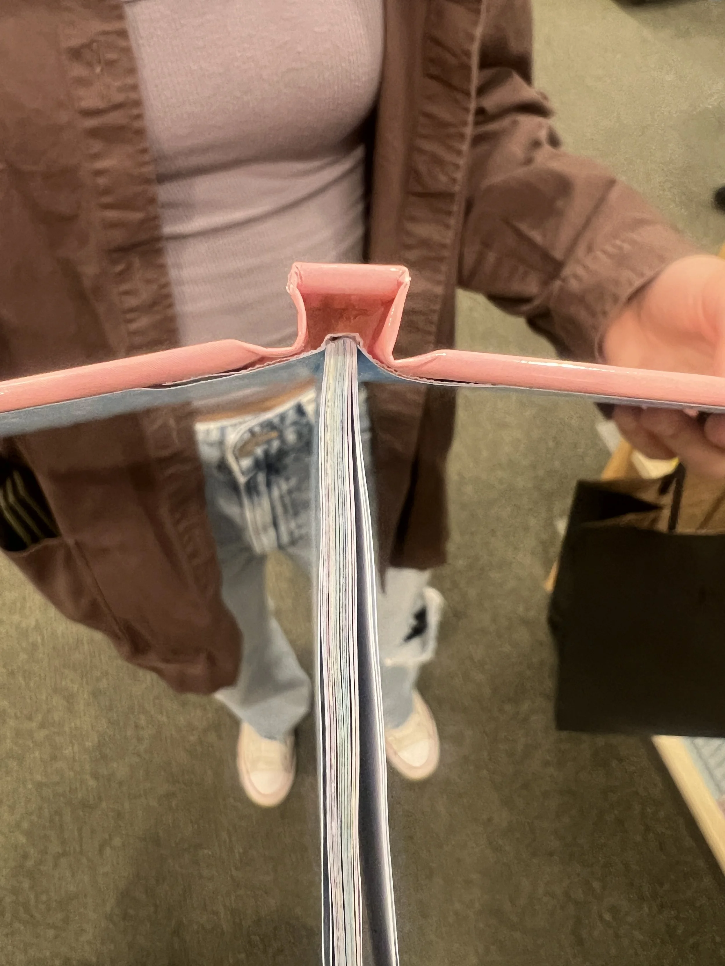

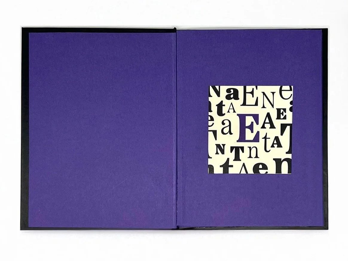
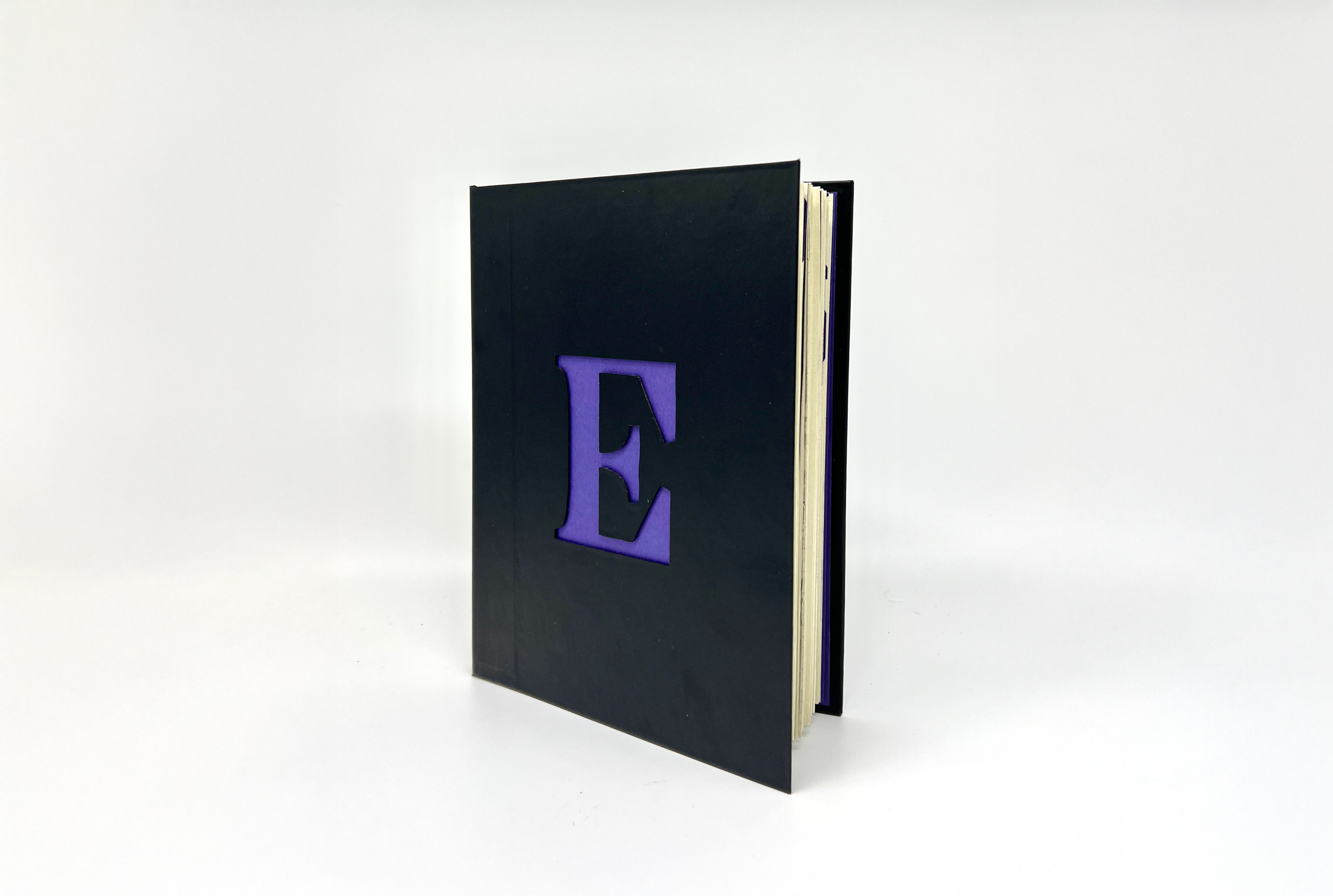
Crafting pages & cover
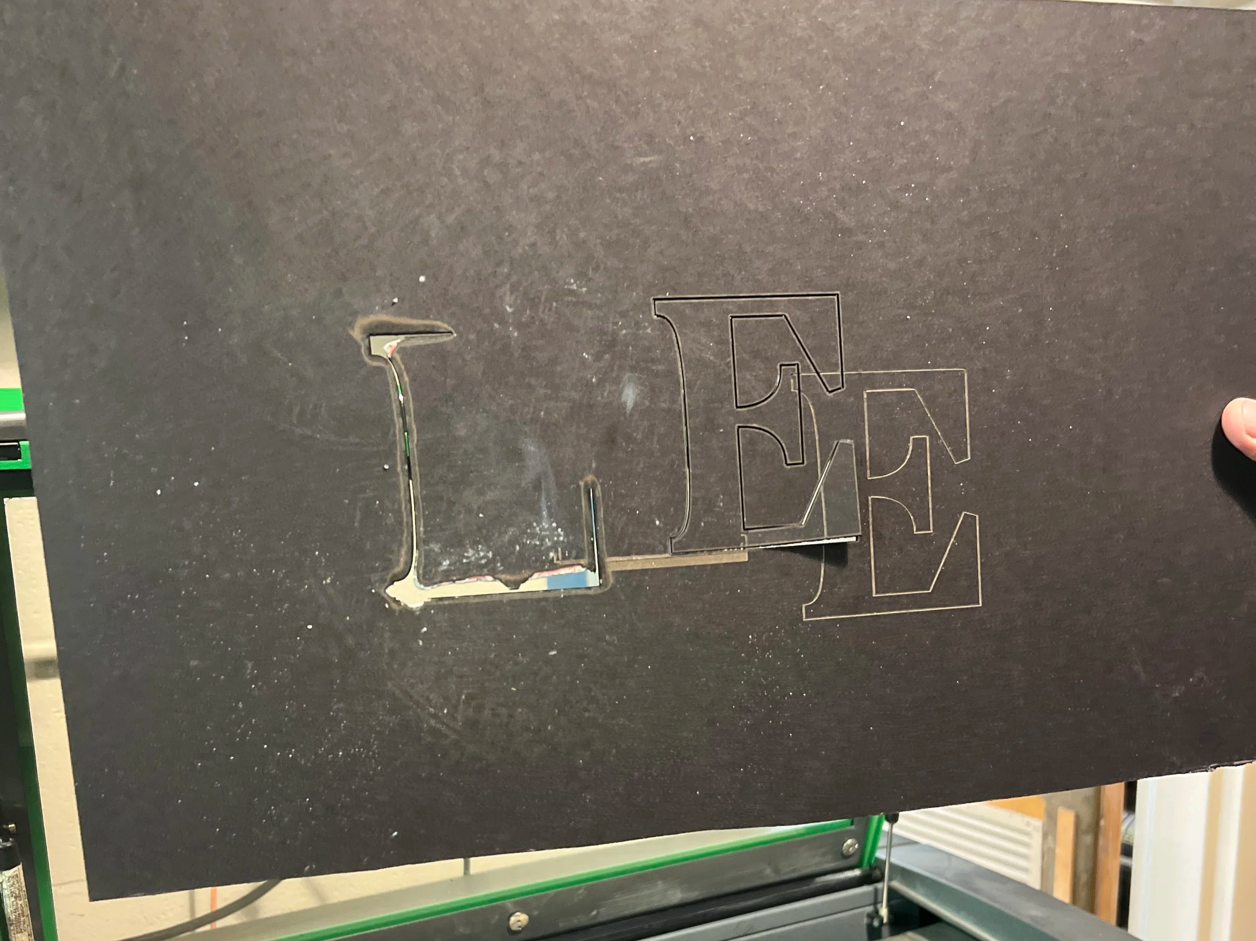

Improvising