
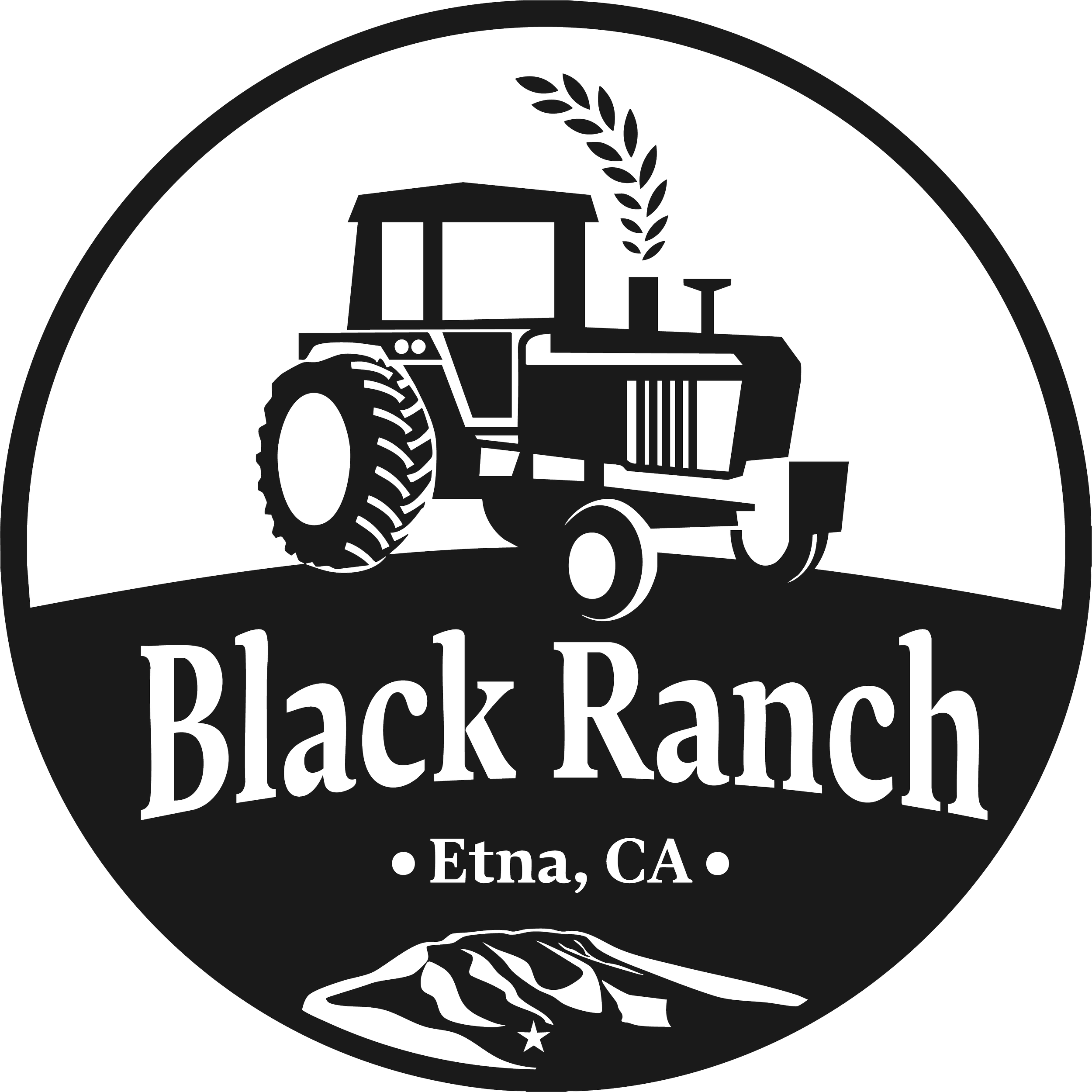
This logo, designed for an organic wheat farm in Etna, California, cleverly represents their farm’s favorite tractor and pays homage to the land their family has farmed for generations. It symbolizes the farm’s commitment to sustainable agriculture and its deep-rooted connection to the local landscape. In a single design, it captures the essence of the farm’s mission and its proud association with Etna.

My Process
I started by talking with the family about their farm and land. They run a small alfalfa and wheat farm in Etna, California, and live up in the mountains. They have a bunch of tractors, including one that’s been in the family since the dad’s father was a kid. They were very open-minded about the logo, just wanting something simple: a black and white circle logo that could be turned into a hat.
Sketching things out

After our conversation, I sketched out a few ideas to start the design process.
Discussing with the client

After designing my first draft I wanted to get some feedback to see if the logo was headed in the right direction. I was guided to reflect more of their land and mountains. I simplified the tractor and boarder, and inverted the bottom half of the logo to make the name and mountain stand out.
Revisions


